I showed amusement by portraying a type of food that is amusing to children. That awesome food is ice cream you eat it at the fair and it has variety in the different colors and flavors of ice cream. I chose this subject matter because it is kind of a tradition in my family to all eat ice cream together at my grandpas house there is a fridge devoured completely to ice cream. This project reminded me of that and the ice cream is unified because they are the same colors but different flavors all stacked on top of each other. For this mixed media project I used tissue paper, glue, acrylic paint, and magazine clippings. I learned how to use the magazine clippings and how to mix the different materials in one project so it would go together. I was a little challenged in trying to incorporate the magazine at last minute but other than that this project was very successful in my eyes.
Thursday, January 2, 2014
Thursday, December 5, 2013
Non-traditional portrait
I choose to do a portrait of my kitten named Sally because I wanted to try to do something other than a dog. I decided to do this project with colored pencil tips because I felt this material could best portray the kitten. My material choice impacted the look of my piece because it added another element to the portrait. The pencil lead gave the picture a texture but it also kind of made all the colors blend. This material choice was very important because the material really brought the kitten to life and if I used a different material it wood look totally different almost night and day. I took the risk of using pencil tips which was a difficult material to attach to the paper and it has not really been used before. One of the major challenges I faced was trying to get the lead out of a pencil and glueing it on was a little difficult. The portrait look very textured because of the use of pencil leaf and it felt rough. The feeling changed to a more fun and spontaneous which is similar to the kitten. My kitten had a connection to colored pencils because the first day that I brought the kitten home she got into the colored pencils and carried them around and we knew then that she was a little bit different.
Wednesday, November 13, 2013
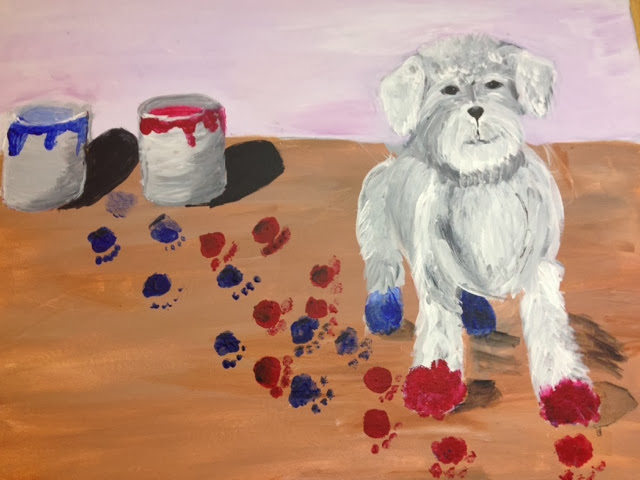
Sticky situation
I developed my idea for "Sticky Situation" from the idea of a dog who got in a very sticky situation and got into some paint buckets. Yes I feel I was able to think outside of the box when I was thinking of this idea because a dog near wet paint is a sticky situation let a lone him getting into the paint. Also having dog can be a bit sticky at times because they tend to get into things which is also why it's a bit sticky. Repetition was incorporated into this painting because of the paw prints on the floor. As well as the wood grin which adds rhythm to this painting but it does not distract from the dog. These both flowed and improved the painting but it also told the story of this situation. Acrylic was chosen for the choice of media because I had used this before and I though it would best portray my idea of a sticky situation. Also it is best for layering which is what is required in this piece because when you are painting an animal with a lot of fur layers are required. The mini lessons were important because I used some of those skills on my final product. I feel this project was successful because I portrayed the theme and the rhythm and repetition was incorporated into this painting as well. This painting also told a story and makes you think what might happen next say this dog gets onto your new couch or maybe he jumps on you in your favorite dress you don't know but hopefully you just get a good memory of when something like this happened to you or even a laugh at the idea of such a sticky situation.
Wednesday, October 2, 2013
Up close and personal
I developed my idea for this project from Pinterest because I saw an publish picture of a flower to show a different perspective. I added shading to demonstrate emphasis as well as different colors to make other things stand out. Colored pencils were my medium for this project because I thought the flower would look the best drawn with colored pencils. The colored pencils fit the best and enhance my piece. The risk I took was by learning a new skill in using colored pencils which I don't do very often. I used the technique of texture in the flower to show the text close up or as they say up close and personal. This project seemed some what successful because I tried very hardto make it realistic. It could be better if I used more value and a deeper concept I will use this blog to improve on my next project in order to grow as an artist.
Wednesday, September 18, 2013
What's the point
For the project " What's the Point" some of my solutions where cacti, and a rambutan which is a pointy Australian fruit. Another solution I had was to draw a circle made completely of points which would be neat to make something without out them. In the end I choose to draw a cactus for my solution because I felt that out of all the ideas I came up with I could best exhibit cacti. I showed contrast by shading and blending lights and darks with a tortillon. I used the scribble sort of technique to show the value in the cacti. The medium I used was charcoal to draw because you can easily blend the shading. I was also interested in trying a new technique of drawing. I used the shading techniques to draw the cacti as well as the skills needed to use charcoal that I learned during this unit. We encourage risk taking in art. Risk taking can be as simple as trying a new technique or learning about a new medium to as complex as trying something totally new. Yes I did indeed take risk with this project because I used charcoal which is something I have never done. Therefore I was a little nervous about it but I feel it turned out well. I am conveying that cacti are pointy and that it is okay to take risk sometime when drawing and even if it is an out of the box idea it can turn out well. I used charcoal unlike many other which is a risk and not a lot of people thought about cacti when they thought of points which is why I feel my project was successful.
Thursday, May 2, 2013
Printmaking Project
The process for making this print was some what time consuming and long. First you chose your animal you would like to make; then you make a clean line sketch using your reference pictures. Line sketch means without shading or any value, instead you make a clean sketch with distinct lines. Then you make a view finder and chose the view you want to portray. After choosing your view you take trace paper and trace over the lines in that area then you flip over the paper and retrace. This way the animal is not backwards when it is printed. Finally you proceed to transfer the sketch to the linoleum. After that you cut out the parts that you do not want the ink to touch you get a bench hook and a roller and you roll the ink and cover the roller. Then you roll it onto the linoleum put it on the paper and smooth it. Finally you have a finished print. I sort of liked this project, but at times it was challenging to not let the ink smear. I learned from this project that it is better to plan before cutting into the linoleum.
Tuesday, April 16, 2013
Subscribe to:
Posts (Atom)